Wednesday, September 22, 2010

DotDotDot part 4 digital shots


For this part of the project we needed all kinds of ideas for displaying our dots or squares out of regular objects and ourselves.

Ideas for dots:
  • black paper cut outs
  • black clothing
  • using our shadows
  • white clothes or dots (neg. photo)
  • bubble wrap
  • spray paint
  • eight balls from pool table
  • jellyfish
  • take picture at night
  • flash lights
  • giant rubber balls
Negative space ideas:
  • white sheet
  • butcher paper
  • white wall
  • white shirts
  • white poster board
  • gigantic light
  • sky
  • cement or gravel
  • white tables
  • black background (neg. photo)
Materials needed:
  • flashlights
  • fingernail polish
  • face paint
  • black clothing
  • black hats
  • double sided tape
  • camera
  • white sheet

Monday, September 20, 2010

8 Texture Pieces

Here are my 8 texture choices that I have come up with. I wanted more range of presentation rather than just a 2D look, so I twisted and crumpled the newspaper in all kinds of ways to add more variety in my collection.

Sunday, September 19, 2010

Creativity Lecture

The lecture on creativity was all about how to be and distinguish someone who is creative and someone who is not creative. People who are creative need to be able to see what is not there, attempt ideas, be aware and curious, and not let cultural or logical means block you from being creative. Basically being creative is being someone who doesn't really let worldly things or concerns beat them or block them from being a creative person. Creative people go around, through, over, and above the limit that other people might have set in their minds as logical or "correct." Creative people do not see limits, just solutions to problems.

The Exquiste Corpse Two


The love beast preached the experience boat.


Yeah, so this sentence really gave me a hard time haha. This is probably because I tried to take it so literal. I went to the lake, the marina, waited for animals to go up to my grandparents boat, and all kinds of other things to get the picture; but none of that worked. So instead of trying to get a picture of what the sentence was exactly saying I took a different angle and made the sentence stand for something other than what it is literally saying. So, I chose my family's mailbox because it has a way to deliver letters, which I turned into a transportation of experience and love. Because after thinking about the sentence for a while I noticed that it was a little silly that a love beast would preach to something that was experienced. So I took it as someone who was young and in love preaching to an experienced elderly, or something like that. So all the letters of love go into the mailbox and are expressed through experience.

Sunday, September 12, 2010

The Exquiste Corpse


The love beast preached an experienced boat.
The language I am using here is visual language to show the story of the sentence I got.

Dot Dot Dot part 2:


Part 2, we use squares instead of dots. We had to arrange them into two categories of periodic, or orderly, and playful. I made plenty of thumbnails to choose from so I could make my final 8 selections. In the final 8 I tried to mix up the interrelationships of the squares in the best way that I could and using the ones that I liked most. I noticed that I used at least 4 squares in each 6x6 and normally made them really big or really small. So, for the final 2 I wanted to incorporate both large and tiny squares. The final 2 are the large overlapping squares for periodic and the interpenetration squares for playful. The interpenetration squares seemed most playful to me because of the disorderly conduct they are arranged in and the negative space. For the periodic one, it had a smooth pattern of squares on top of each other and I liked the fact that they were large and took up the whole page to give a more interesting effect.

Thursday, September 9, 2010

Cardboard Progress


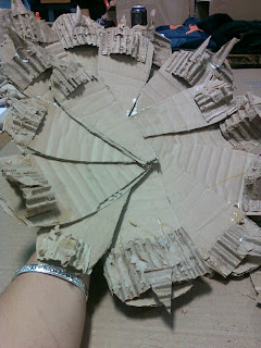
When I was critiqued on my project the members at my table could tell what the object was going to be like before seeing the actual object, and could make sense of my progress. They said that my detail was very good and that the texture of the pine cone petals were great. The thing I needed to work on more was covering the top of the pine cone with more petals and make the core of the body of the pine cone with more thicker and even bigger petals. I agree with them very much, my only concern would be how quickly I could get this done with bigger petals. So I am going to try it out and see how it works.

Cardboard and Nature Object Studies


For my cardboard and nature object project I got a pine cone. Yea, turns out its not this complicated thing I thought it out to be, but it is not by any means easy. First impression I got was that it was kinda painful haha; it was bristly and poky. So I wanted it to have that same effect on the 3D model as well, I made tiny triangle cardboard cut outs and glued them to the end of the pine cone petals. So I'm trying to involve a lot of texture to this thing. I've analyzed this thing so far as to smell and taste it, and yes it does not taste good. The point being, I've come to realize that a pine cone is a very defensive type of object in nature. With this in mind I made sketches of all aspects of the cone in many different ways, especially focusing on the petals and the overall shape.

Tuesday, September 7, 2010

Thursday, September 2, 2010

Lecture Summary

So, the whole gist of all our readings were surrounding were the make up of form and how it effects the mind; depending on how it is represented to us. Basically it was a composition of composition. Teaching us how to critique things by the way they are given to us as to how we perceive them. Such as the Gestalt theory, which is the understanding of perception and form by organizing it's components to make a meaningful whole. It helps us understand what the artist is trying to get us to see. So the four aspects of Gestalt are: closure, continuance, proximity, and similarity. Closure is where the elements of a design are placed so that you perceive the design as a whole rather than separate pieces. When the eye can follow a dominant form without interruption, that is continuance. Proximity is the distance between parts in a form and similarity is where the parts in a form are similar and can also be an effective way to create meaning. All these aspects help us understand from as a meaningful whole and not as isolated parts. Along with these aspects, you must have visual interactions of form involving position, direction, and space. Negative space is also important when working with a form, being an active area of composition. Therefore, form is composition or a variety of different elements working together to create a whole. Elements that make this happen are: dot or point, line, shape/form, color/hue, texture, space (and negative space), and value. By knowing all of these concepts you start to understand how to view different images and figures in ways that you may not have thought to look at them before you knew all of this. It creates a more concentrated visual so you can see the picture or sculpture as a whole, break it apart in your mind as separate pieces, and then reconnect them again to make a whole again. This way you know everything that makes the image or figure tick. Creating a full overview that allows you to see it for what it really its. You are able to back up your figure or explain in further detail why it works in what you are doing. So at the end of the day you can look at a chair but not instantly think "chair" when you see one. Instead you can see lines, a base, the contours if it has it, the color of the pieces used to make the chair, and bolts and screws. You realize all of it's parts to make the picture come true. So in conclusion, form is the sum of the total of physical characteristics that make a meaning whole; which may or may not give a narrative characteristic on the form.

Pick 16, final 4, and the 4 refined


I started off with the 16 picks at the top of the screen for the group critique. My group felt that I had a lot of negative space in most of my designs but that I used about the same amount of big dots and smaller dots. They also pointed out that most of my designs seemed very well planned out and not just randomized. Which is true for most of them. Along with that they noticed that I had a habit of making the dots lack symmetry and that none were ever centered in the square. I would always have them a little off; and this I intended. I didn't want it to be so structured; I thought that some of them being off a little would make it more interesting and less boring. When my group started organizing them into categories, I was surprised at the places that they put some of my designs in. Funny enough though, once they put them into the categories I couldn't really see them in any other category once they put them there. So for the final four that was selected I decided to make some dots a little bigger, so as to not put in too much negative space in my collection, and also to subtract dots and actually center them more. And seeing them all together, they really do look good and they give off the closure, continuance, proximity, and similarity that I wanted.