
Thursday, October 28, 2010
Monday, October 11, 2010


Thursday, October 7, 2010
8 artists; repetition post
Today

Anne Wilson-Mess, 2006
This piece sits closer to the contrast section of the monotomy scale because of the chaotic motions of the marks on the piece as it gets bigger. The effect this piece takes on me is that it feels like a growing frustration that finally goes into full motion at the end kinda ending in disaster, but a pretty disaster haha.

Anne Wilson-Portable City, 2008
On the monotomy scale, this piece sits more in between harmony and contrast because it has a good balance of line structure. It makes me feel like a railroad track with fast moving cars; this whole motion of this piece makes me think that everything is moving quickly.

John McCracken-Flare, 2008
I would say that this sways more towards harmony because even though it is called flare, it is a more soothing flare to me, and more organized. The repetition makes me think of a cooling flame I guess. I love the colors and the way they are presented.

John McCraken-Fire, 2007
On the scale this piece is more in the middle, but closer to contrast, for me because it is less calming to look at than the Flare piece in the previous piece. This one makes me feel more enclosed and kinda hard to look at because of the harsher colors and presentation of the entire piece.
Post Minimalism

Gabriel Orozco-Black Kites, 1997
This piece, I think, is also more in the middle of the monotomy scale. This is because the pattern of the black diamonds are well spaced in a rough manner. I really like this piece and it reminds me of like skater/surf companies.

Gabriel Orozco-Atomist, 1996
So on the scale for this one I would place it in the center of the middle and contrast, because it's like two pictures trying to overcome the other. I really don't like this piece, it kinda gives me a headache.

Anish Kapoor-Eternal Bonds, 1977
I would put this pretty close to contrast because it has less flow and more of like a random placement of the poles with paper on them. This piece makes me feel like an old time horror movie, with no sound.

Anish Kapoor-Void Field, 1990
Harmony is actually were I would put this one closer to because of the way the rocks are placed and the calming, sorta neutral color. These pieces make me think of like a civilized city or something of the sort.
Minimalism

Sol Lewitt-Isometric Projection #13, 1981
I would place this piece in the middle of the scale because it is very constructed and organized into an actual shape. This piece is not very interesting to me and kinda makes me feel dizzy at times.

Sol Lewitt-Untitled, 1992
I would put this one in the middle of harmony and the center of the scale because it is interesting in the shape of a star and because the colors harmonized well together to me. This piece makes me think of like a football icon or something that has to do with sports, like its pulling me into the star.
+1972-73.jpg)
Dan Flavin-Untitled (to Jan and Ron Greenberg), 1972-73
This piece is harmonizing on the scale because it has colors that go well together and like they are representing people.

Dan Flavin-Monument 1, 1964
This piece would be put in the middle of the scale because it has an even growing repetition of the lights. This reminds me of like a growing skyscraper in the city.
Abstraction Expressionism

Jackson Pollock-Blue Poles, 1952
This one goes very close to contrast but has a harmonic feel to it I think because of the dramatic black marks in a pattern on the piece. This one makes me think of our new project with the ink marks that we are working on in class.

Jackson Pollock-Autumn Rhythm, 1950
This one is pretty much contrast/chaos all the way, considering that the splatter patterns are all over the page. This piece is hard for my eyes to follow because they want to go all over the page at the same time, so it is very confusing.

Louise Nevelson-Dawn's Wedding Chapel IV, 1959-60
This one goes in the contrast sector of the scale because it shows like a complicated inside of a pocket watch or something, seeing all the chaos and everything flow together. All the pieces inside of the piece make me want to follow it all like a giant doll house and I expect little people to start walking around in it.

Louise Nevelson-Dream House XXXII, 1972
I would put this in the middle because it is called dream house but it looks more like a horror tower. So like an in between of good and evil. It makes me want to follow it up and down and back around, like continuance. It keeps the piece very interesting and the name makes you look at it again in a different way; other than thinking it is supposed to be like a Barbie dream house or something.
Wednesday, October 6, 2010
Quotes...
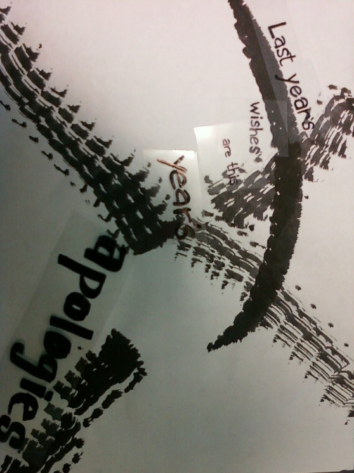
- "Last year's wishes, are this year's apologies."
- "I'm in love with my own sin."
- "We're the new face of failure."
- "bullet-proof loneliness, at best."
- "Feel, like I'm the only one."
- "it ends tonight."
- "weapons in the form of words."
- "fortune favors the brave."
- "no light to break the dark."
- "common sense ain't common."
The first two are my top choices and the first one is the one that I am going to use.


Tuesday, October 5, 2010


Project 2 marks


Subscribe to:
Posts (Atom)